


Bar Graphs, Pictographs, andCircle Graphs
© Copyright all rights reserved to Homework depot: www.BCMath.ca

I) Bar, Circle, and Pictograph:
Data can be represented using a “Bar Graph” , “CircleGraph”, or a “Pictograph”
Different types of graphs is better for comparinginformation from certain scenarios
Circle Graph
Bar Graph
Comparing data fromdifferent categories
Best for comparingeach category inrelation to the whole100%
Best for displaying datathat can be easily countedwith symbols
© Copyright all rights reserved to Homework depot: www.BCMath.ca

Bar Graphs:
Bar graphs are used to compare counts from different groups
Ie: which player has the most points, which coffee is sold the most
The vertical axis should have a range that includes all the counts
Usually you divide the vertical axis into increments that aremultiples of 10, 100, or 1000 OR something easy to count
The horizontal axis should include names of people or categoriesthat you are comparing
© Copyright all rights reserved to Homework depot: www.BCMath.ca
Ex: A group of students were asked which subject was their favourite.Use the graph to answer the following questions
English
P.E.
Math
Science
Social St.
French
a) How many students were surveyed?
b) What percentage of students prefer Math
c) Challenge: If the bar for Science disappeared, but you were told the that percentage ofstudents that chose P.E. was 20%, then how high is the Science bar?
Frequency
© Copyright all rights reserved to Homework depot: www.BCMath.ca
20
35
50
30
5
40
students
II) Pie Charts
Show the relationship of the parts to the whole by visually comparingthe sizes of each section
The area of each sector is a percentage
The accumulation of all the sectors is 100% (1 whole)
Note: All the categories must add to a “whole”
The count is usually not given
© Copyright all rights reserved to Homework depot: www.BCMath.ca
The pie chart below provides information on which music genre ismost popular amongst radio listeners from ages 20 to 45. Based onthe chart, which statement is true?
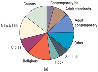
a)Country and Religious music are Played on
the radio more often than Rock and Oldies
b) Spanish Music is more popular than Country
Music
c) Country music is better than Rock
d) Most adult listeners prefer the news than Rock music
e) More than half of adults listeners prefer either Country, Religious orAdult contemporary music
The answer is:
© Copyright all rights reserved to Homework depot: www.BCMath.ca

Practice: Jason is a manager at Starbucks. The following graphsshow the daily sales in his coffee shop. Analyze the graph andanswer the following questions:
Which coffee is the most
popular?
Which type of coffee sold theleast cups of coffee?
How many times more cupsof House Blend was soldthan Expressos
© Copyright all rights reserved to Homework depot: www.BCMath.ca
The following graph represents the same information. Use thegraph to answer the following questions.
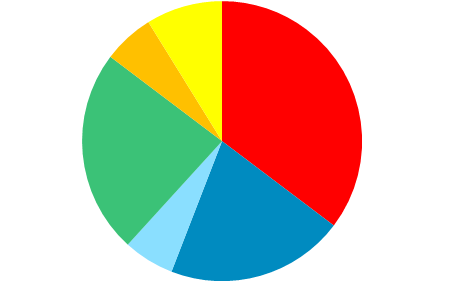
Starbucks Coffee (850 cups)
What percentage of the coffee sold wereHouse Blend?
What is the top three coffee sold atStarbucks?
Looking at this graph, how many cups ofDark Roast is sold daily?
How many cups does one picturerepresent?
Using only the pictograph, howmany more cups of Dark Roast thanMochas were sold?
How many cups of Light Note,Expresso, and Cappucinos were soldaltogether?
© Copyright all rights reserved to Homework depot: www.BCMath.ca
Which Graph is more Useful?
To determine which graph is more useful, we need tolook at the context of the question
Ex: The principal wants to create a program to counter attackunexcused absences in school. According to the graphs provided,which grade level should he/she focus on?
Gr.8
%
Gr.9
Gr.10
Gr.11
Gr.12
% of all Skippers from each Grade
% of skipperswithin each grade
Majority of all students skippingare in grade 12, but only a smallpercentage skip
A large percentage of 8’s aremissing class. Therefore, focus onthe 8’s.
The information provided by thebar graph can not be made with apie chart
© Copyright all rights reserved to Homework depot: www.BCMath.ca
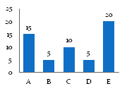
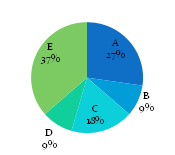
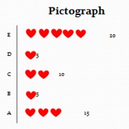
Looking at all three graphs, what are the advantagesand disadvantages of each graph?
Bar Graph
Circle Graph
Pictograph
Easy to compare howmuch more one categoryis compared to another
Only percentages aregiven, so need tocalculate the count foreach category
The percentage of eachcategory is not given
The percentage of eachcategory is not given
Categories are displayedas percentages. Easy tocompare
Easy to get the numberof cups sold for eachcategory
Advantage:
Advantage:
Advantage:
Disadvantage:
Disadvantage:
Disadvantage:
© Copyright all rights reserved to Homework depot: www.BCMath.ca
TIMEPLOTS
Used when data is collected over a period of time
Observes how a variable changes over time
Stock prices/Mutual Funds
Time on x-axis, Price/Value on y-axis
© Copyright all rights reserved to Homework depot: www.BCMath.ca
Ex: The following graph shows the cancer mortality rates for femalesin Canada from 1977 to 2006. Use the graph to answer thefollowing questions00
Years
Rates (100,000 ppl)
Lung
Breast
Stomach
Colorectal
What are the variables used in thisgraph?
What type of graph is used?
Can the same information be displayed in a Bar graph? Why or why not?
Can the same information be displayedin a Pie chart? Why or why not?
What are the variables used in this graph?
Cause of Death (Categorical)
Year (Quantitative)
Rate of Death per 100,000 women (Quantitative)
What type of graph is used?
Line Graph or Time graph
Can the same information be displayed in a Bar graph?
No, because a bar graph can not be used to displaychanges over time
Can the same information be displayed in a Pie chart?
No because a pie chart can not be used to display thechanges over a period of time
© Copyright all rights reserved to Homework depot: www.BCMath.ca