
5.2 MisrepresentingData5.2 MisrepresentingData
5.2 MisrepresentingData5.2 MisrepresentingData
© Copyright all rights reserved to Homework depot: www.BCMath.ca
Misleading Graphs
•What’s wrong with this graph?
Who’s Your Favorite Teacher?
# of Votes
Teachers
Mr.W
Ms.X
Mr.Y
When one bar hasa greater width, it makesthat person seem morefavorable
All the bars should havethe same width
Ex: What’s wrong with this graph?
Q: Which shape is the most popular?

The happy faces are
much bigger than the
other ones
This makes it seemmore popular than it is
What is wrong withthe pictograph?
Misleading Data with Distorted Scales
•The Y-axis can be skewed to distort data
•This happens a lot in business to:
–Exaggerate a growth in profit
–Minimize a decrease in loss
o
20
40
60
80
100
120
2012
2011
95
100
105
110
115
120
Millions $
Millions $
2012
2011
Company revenue in2011 & 2012
Company revenue in2011 & 2012
What differences do the two graphs have?
Which graph is bias and how is it bias?
The Y-axis have different increments. Left begins at zero.Right begins at 90.
The right graph is bias because the distorted scales makes the growthin revenue look bigger than it is
Practice: The following table shows four of Jason’stest scores. Explain what is wrong with eachgraph:
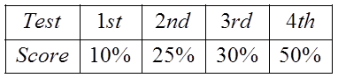
Pie Chart:
Bar Graph
Time Plot
Pie charts are tocompare differentcategories to a whole.These scores are notfrom the same test.We are not comparinganything to 100%
The bars havedifferent widths. Itmakes the last scorelook a lotbigger/better thanthe previous tests
Time plots are forshowing progressover time. The x-axis should displayunits related to time.Not categories ofdifferent tests
Homework: